%20(10).png)
Government bonds have been a hot topic of late, with wall to wall media coverage around the world. Much of this focuses on US Treasuries and UK Gilts, however over a narrow stretch of water another country has slipped under the radar to some degree. This week we take a look at France and how it compares to its neighbours.


Regular readers may well be familiar with the concept of a yield curve, but for those that are unsure, this is a plot of bond yields for a particular issuer. At a high level it is a fairly simplistic notion, but of course in reality there are various complexities.
For a liquid government issuer (in this case France) there will be many different issues and trying to plot a point against each would create a potentially very jagged line. Instead (typically) specific liquid issues are chosen as this allows a smoother line to be drawn. Given the shape of this line, it is known as a curve and given it is a curve based on discrete yields it becomes a yield curve. As a side point, whilst this is constructed from discrete points, there are occasions when interpolation is used, but that is a topic for another day.
Below is the change in the shape of the yield curve for France since the start of 2026.
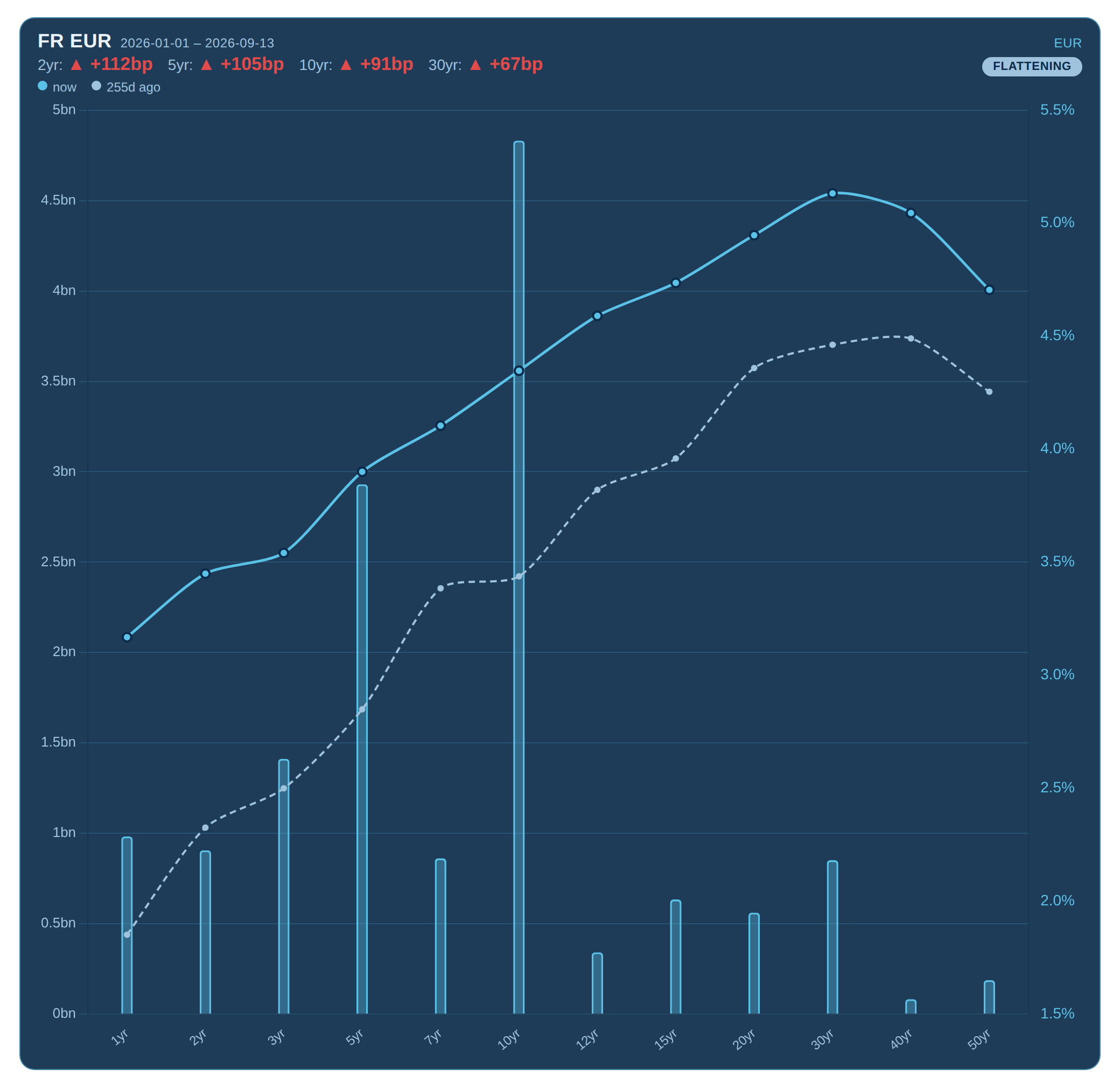
Looking at Chart 1, we can see that the French yield curve bears resemblance to many others around the world. The average 10yr yield for G7 countries (of which France is one) is now higher than in 20081, which may bring back memories for those who experienced the Global Financial Crisis2.
The front end of the curve has increased (known as widening) more than the back end, this is referred to as a ‘curve flattening’ as the gradient is gradually reducing.
Aside from the yield curve of a single entity, it can be helpful to compare against a peer or ‘benchmark’. For Eurozone issuers it is commonplace to use Germany as the benchmark, indeed it is not unusual to see other European Government Bonds (EGB’s) quoted as a spread over the equivalent German Government Bond.
Below we take a look at how this spread has changed (for the 10yr) throughout 2026.
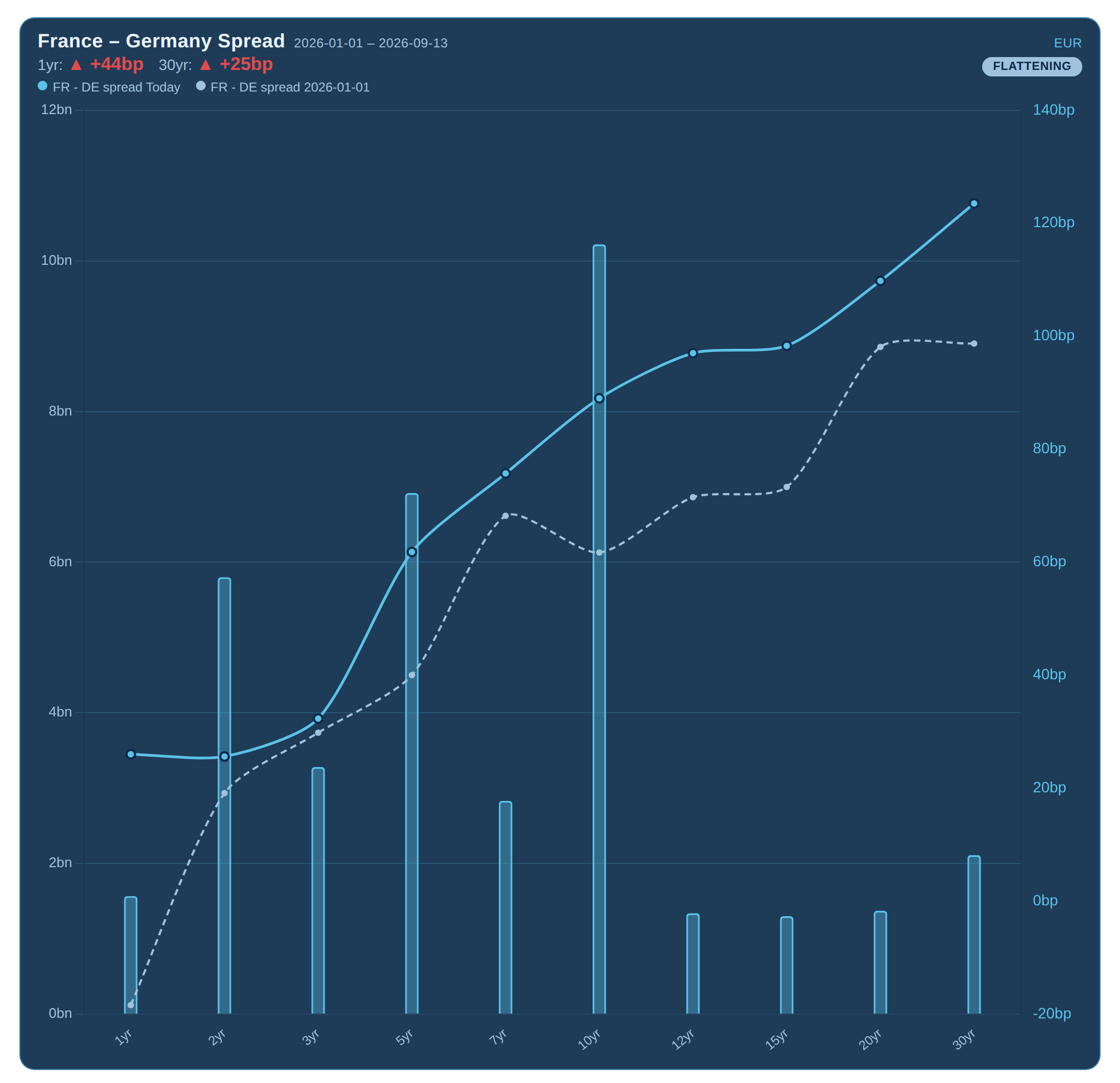
We can see that universally across the curve, the spread against Germany is higher than at the start of the year (the spread is the difference between the yield of a French Government Bond and the associated German Government Bond equivalent).
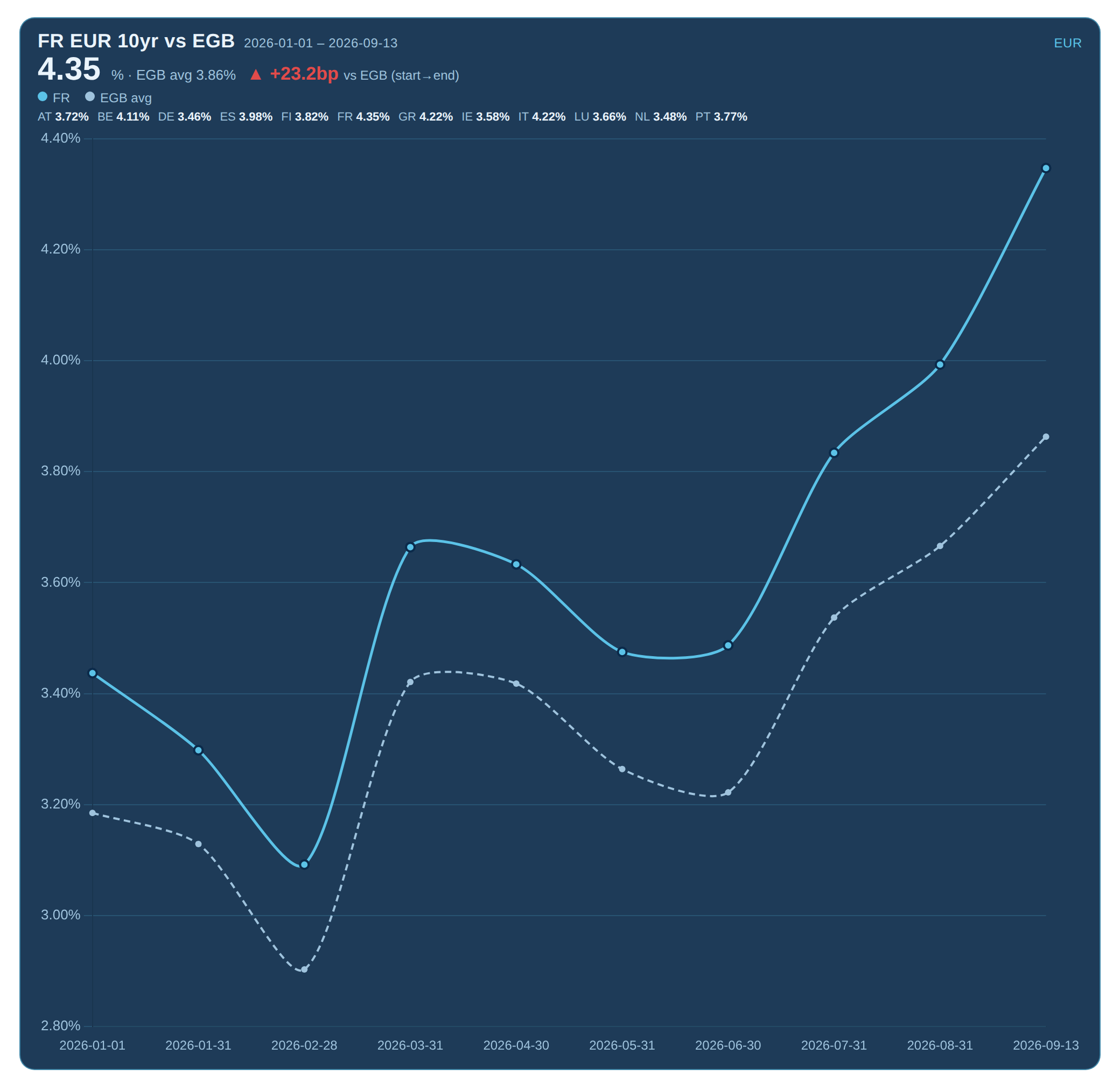
As mentioned, France is considered an ‘EGB’ issuer and therefore it seems logical to not only compare against Germany, but against the wider pool of comparable EUR denominated government bonds.
Below we can see a comparison between the French 10yr against the Eurozone average and it is notable that French yields are almost 25 basis points higher above the EGB average yield than they were at the start of the year.
MiFID data is commonly used to observe activity on a transaction by transaction basis and this is increasingly possible in near real-time, with the advent of the UK Consolidated tape and the highly anticipated European equivalent seemingly just around the corner3.
As is highlighted throughout this article, various insights can be drawn out, by taking the raw price or volume data and using it to plot curves or aggregate volumes.
Whilst France is the subject this week, the same approach can be applied to (almost) any entity across the spectrum and not just sovereign issuers, but corporate or agency ones too.
MiFID data can also be joined with other datasets such as TRACE or DTCC to determine aggregated volumes, or other analytics such as the CDS basis (the difference between the ‘credit spread’ on a bond and the associated CDS spread).
“French yield curve and spread shifts make an interesting use case for highlighting the value of MiFID data. Notable shifts have occurred throughout the year and by deriving analytics from the raw trade reports, far greater insights can be drawn out.”

2https://www.investopedia.com/articles/economics/09/financial-crisis-review.asp
3https://quoteddata.com/2026/07/esma-clears-first-eu-wide-trading-tape-for-shares-and-etfs/

Original photograph taken by Richard Hadley
Dan Barnes - Dan is a highly experienced market commentator and founder of multiple media ventures including Trader TV and The Desk.
He is contributing as a guest editor for Propellant Insights ahead of starting a new venture in Q4 this year.
Vidal Mehra - Vidal is Chief Product Officer for Propellant Digital and the lead author for Propellant Insights.
He has been working with financial institutions for over 20 years across multiple disciplines including front office and consulting roles.

Helena Roughton - Helena recently joined the team as a Product Manager, bringing extensive MiFID policy experience having previously worked at AFME.
She also brings product remediation and data analysis experience from the Bank of New Zealand.

%20(9).png)