

Long-end bond yields have been a constant topic of conversation throughout the media in the last few weeks. We wanted to look at the extent to which this excitement translates into trading activity, as liquidity (and therefore expected turnover) is typically thought be higher at the shorter end of the curve.


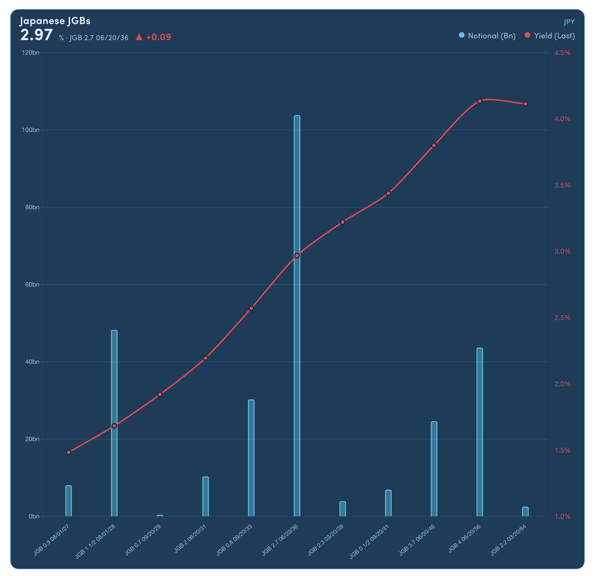
In the world of bond trading, there is a concept of a yield curve1, which typically shows us the rate of return for bonds, tracked from shorter to longer maturity dates.
A traditional yield curve is ‘steep’, with yields for shorter-dated bonds lower than longer-dated bond yields2. This can reflect shorter-term risks being more predictable (with bonds carrying lower relative risk premia) and longer-term risks being less easily anticipated (with bonds carrying higher relative risk premia). It can also reflect an expectation of rising rates, with investors demanding premia for investing in the longer term now.
Below is an example of the Japanese Government Bond (JGB) yield curve from 1st September this year.
While the ‘long end’ does not have a universal definition on the curve, for the purpose of this article, we will treat 10 years as the starting point3, which broadly aligns with the threshold between ESMA’s Transparency Groups 1 and 2 - roughly separating more and less liquid instruments.
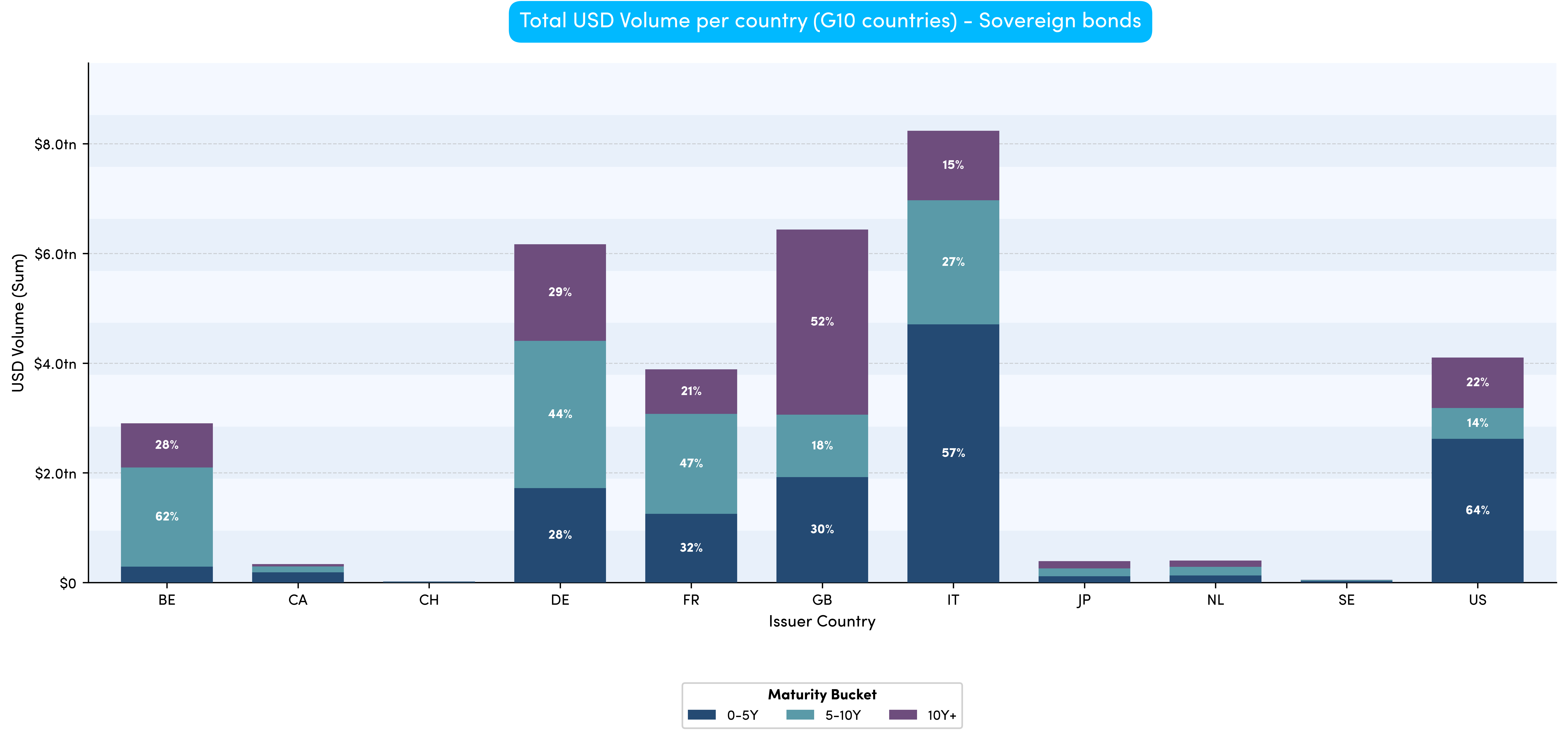
When looking at the year-to-date MiFID data for G10 sovereign bonds, we can see quite a mixed pattern. There is no clear-cut trend, with each G10 nation seeing different proportions of flow at different points along the curve.
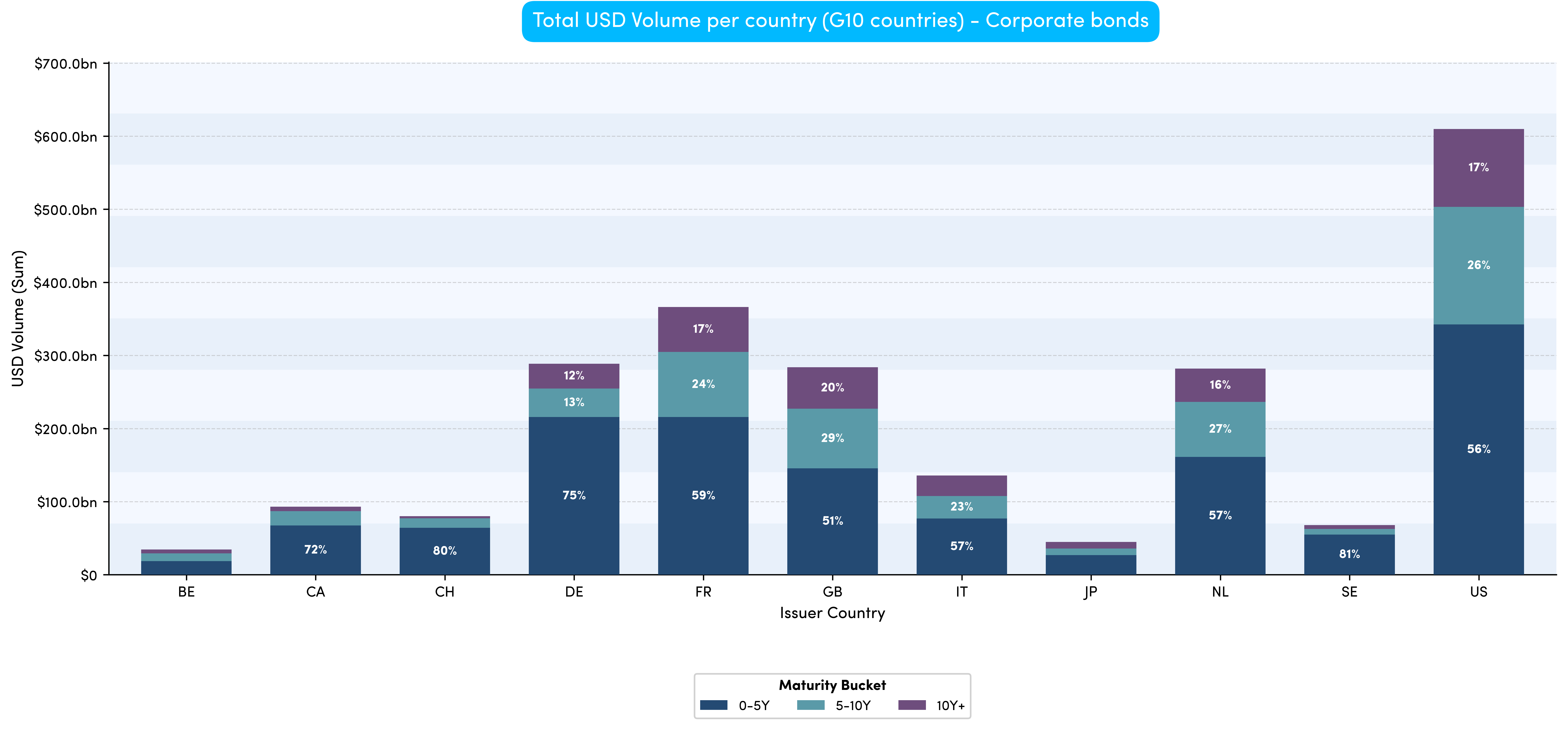
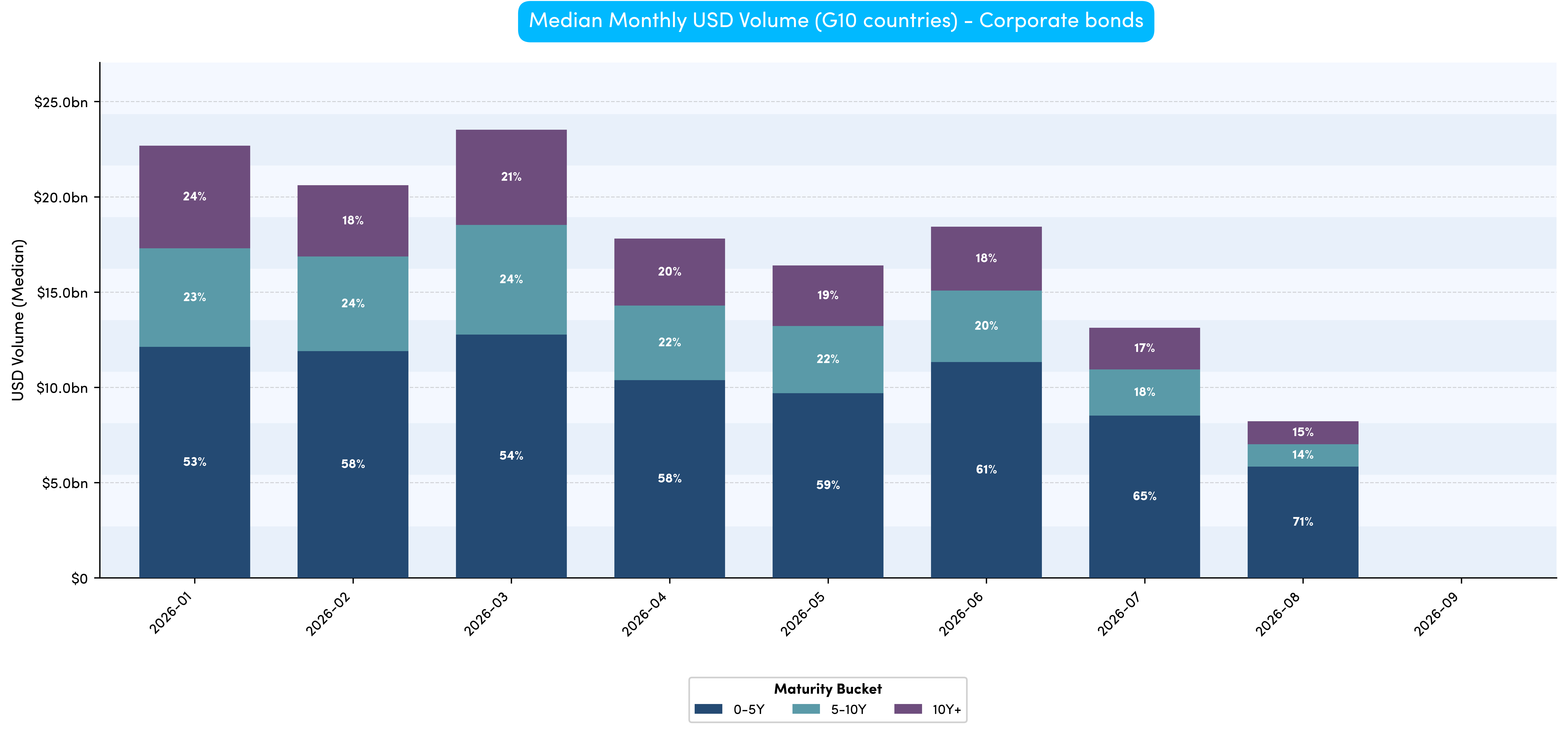
When we switch focus to corporate bonds, interestingly a trend becomes more obvious, with greater flows seen on shorter-dated bonds (i.e. ‘the front end’).
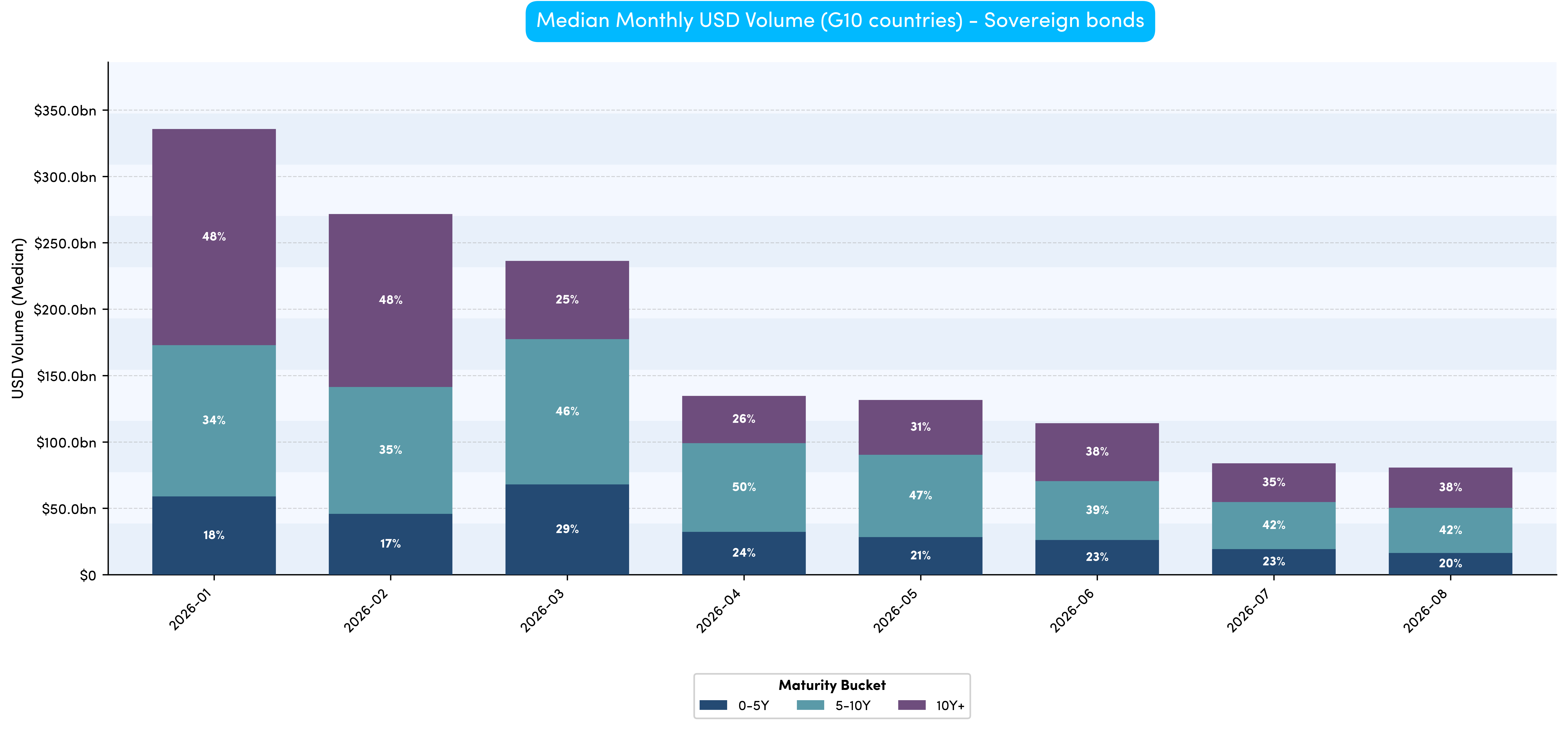
We now switch to looking at the monthly breakdown across all G10 sovereigns and a pattern immediately emerges. The proportion of long-end flow has decreased (since the start of the year), however as regular readers know, long-end activity is more likely to be deferred and therefore it is plausible the flows are not quite as low as shown.
Corporate bonds show an even more pronounced trend towards middle- and shorter-dated activity (albeit with the same caveat as for sovereigns around deferrals).
When looking across G10 nations the data shows us that whilst there is a clear trend towards a higher proportion of trading activity on shorter-dated corporate bonds, however, the same is not universally observed for sovereign bonds. For example, whilst this is the case for the US and Italy, UK flows have been focused at the long end and the rest typically in the middle (5 - 10 years).
The time series data provided a more interesting perspective as we then saw a trend appearing to emerge, possibly suggesting long end G10 sovereign flows have decreased (however we need to wait for the deferral data to be sure).
For corporate bonds, it apears that short-dated activity is proportionally increasing (but again we must wait to gain full confidence).
“Whilst some trends appear to be emerging we need to wait for additional data before we can be sure. It seems likely that market participants have gravitated towards the front end of the curve, however once the deferred data is published for Q3 we will get a better idea.”

1https://www.investopedia.com/terms/y/yieldcurve.asp
2https://www.investopedia.com/terms/y/yieldcurverisk.asp
3https://www.nasdaq.com/glossary/l/long-end-of-the-yield-curve

Original photograph taken by Richard Hadley
Dan Barnes - Dan is a highly experienced market commentator and founder of multiple media ventures including Trader TV and The Desk.
He is contributing as a guest editor for Propellant Insights ahead of starting a new venture in Q4 this year.
Vidal Mehra - Vidal is Chief Product Officer for Propellant Digital and the lead author for Propellant Insights.
He has been working with financial institutions for over 20 years across multiple disciplines including front office and consulting roles.

Helena Roughton - Helena recently joined the team as a Product Manager, bringing extensive MiFID policy experience having previously worked at AFME.
She also brings product remediation and data analysis experience from the Bank of New Zealand.
%20(11).png)

%20(10).png)